 This happens to all of us. We KNOW we've not done our best work. Something's a little soft. Or some elements in the photo blend in too much with other elements. The perspective may be all wonky. But man, the colors are so cool that we just can't bear to toss those photos right now. We're hoping the dramatic colors will distract the viewer from the sloppy photography. And that's what happened this evening.
Chris and I headed down to Yachats to have dinner. The sun had set and the sky was bright orange. I had my camera but we'd taken the tripod out of the car. Bad move. Stop #1 was an overview of the beach and a surfer was heading home for the day. The colors are wonderful, but his body blends in with the patch of darkness behind him, which isn't good. And the photo's somewhat soft.
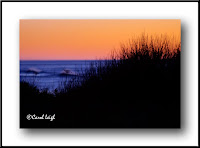
 Stop #2 was in Yachats and I liked the way the grasses were silhouetted against the orange sky and how the blue ocean shows through on the left. There were some flowers (either yarrow or Queen Anne's lace) sticking up against the ocean, but a dark wave ended up right behind them, turning their bold forms rather amorphous.
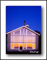
And stop #3 is also in Yachats, where the outrageous orange sky reflected wonderfully in the windows of this house. The background cobalt blue sky looked pretty darned good, too. I'm shooting at an angle with no tripod and all the lines are skewed. I tried to alter the perspective in Photoshop, but I didn't do a very good job.
BUT LOOK AT THE COLORS! Pay no attention to shapeless blobs, soft focus, and tilted architecture! Are the colors not cool? See? You were seduced, too. Eye candy. Sweet, but short-lived. Heavy sigh. ©Carol Leigh


4 comments:
#1 is so close to awesome I'd give it a 99. The softness doesn't work against it -- maybe actually works with it. He could be a smidgen to the right but that makes it look authentic, that you didn't have a chance to pose him. No points deducted on this one!
And you, madam, are WAY too kind! Thank you anyway. -- Carol Leigh
But, but, but....#3 is so close. Don't you think it would be better if you worked on it for 2 or 3 more hours? Gave it your best shot?
Oh yes, down the rabbit hole we go. I too, am a sucker for color. And I also fall prey to the notion that good color can override less-than-stellar technique.
Still, I'm really taken by #3. It has potential, really :-)
Don't know if you know, but your first photo, when clicked on to enlarge, opens a message that allows one to upload the photo in Photoshop. The message says: "You have chosen to open _MG_2683WF.jpg followed by options of what to do with the file.
Thanks for sharing these photos. I always appreciate these blog lessons. I have way too many of my own (photos) from the 1000+ shots I took over Thanksgiving.
Post a Comment